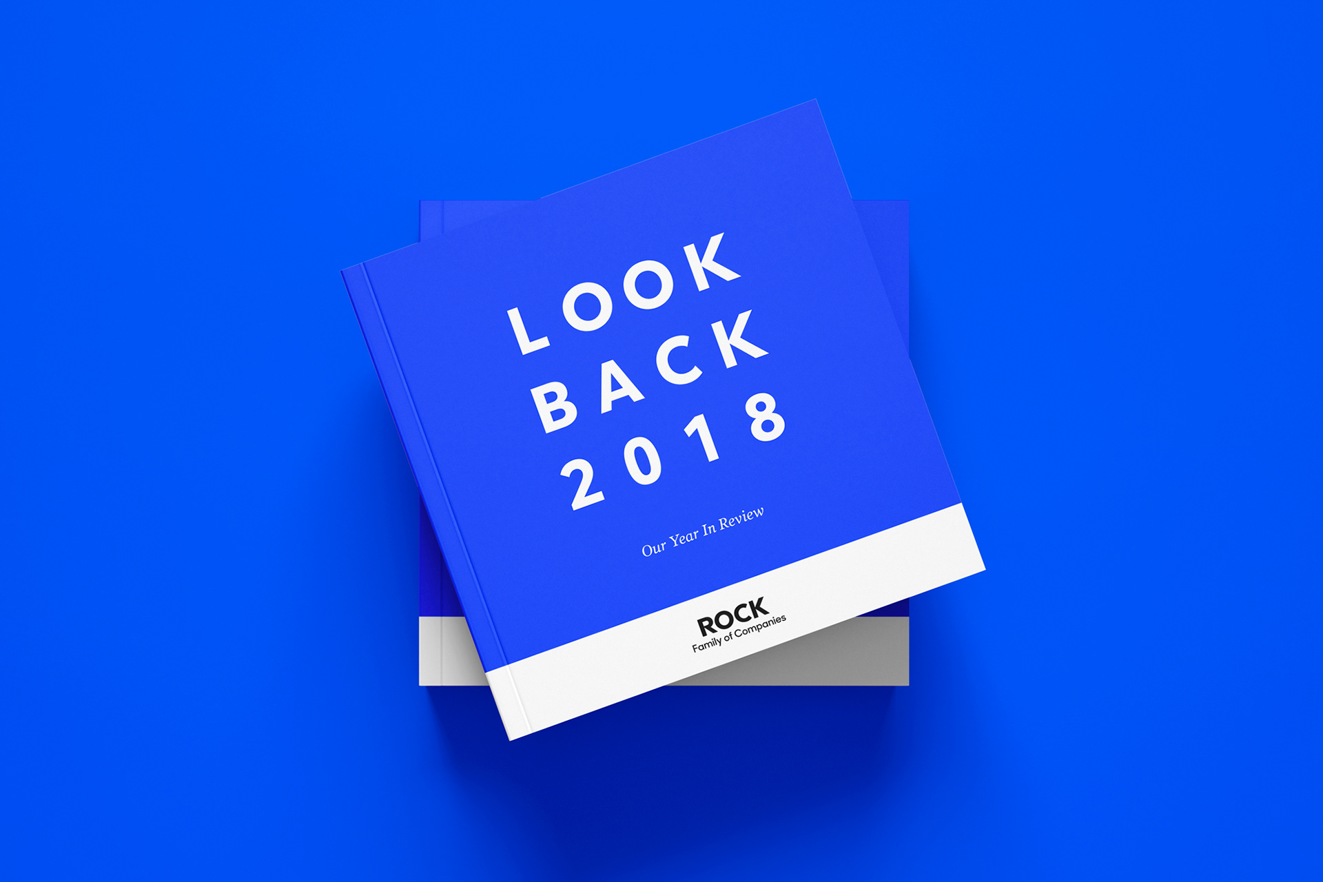
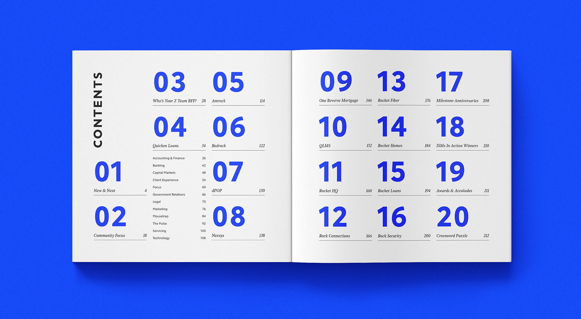
The Rock Family of Companies is made up of several distinct businesses—like Quicken Loans—connected by a shared culture and values. To celebrate collective achievements and foster a sense of unity, the internal marketing team created the Look Back Book: an annual publication highlighting major company milestones, high-level wins, and team member shoutouts across the organization.
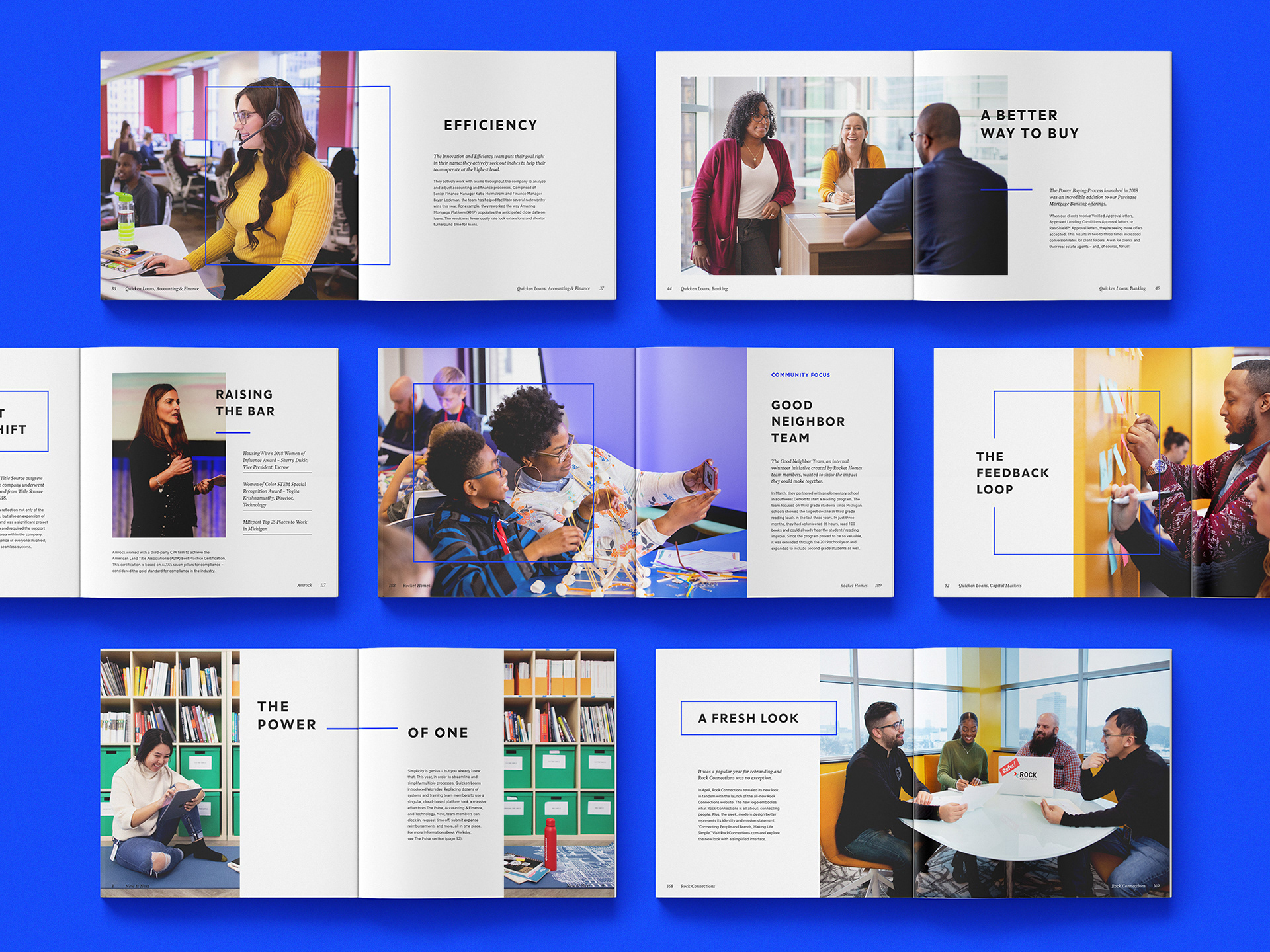
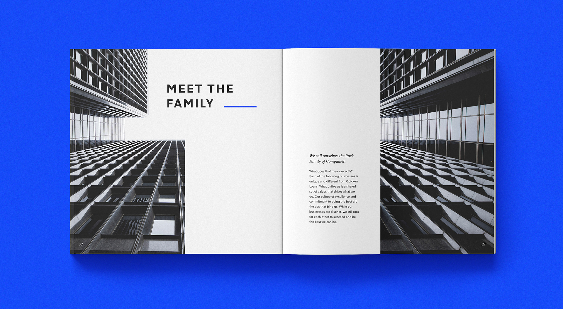
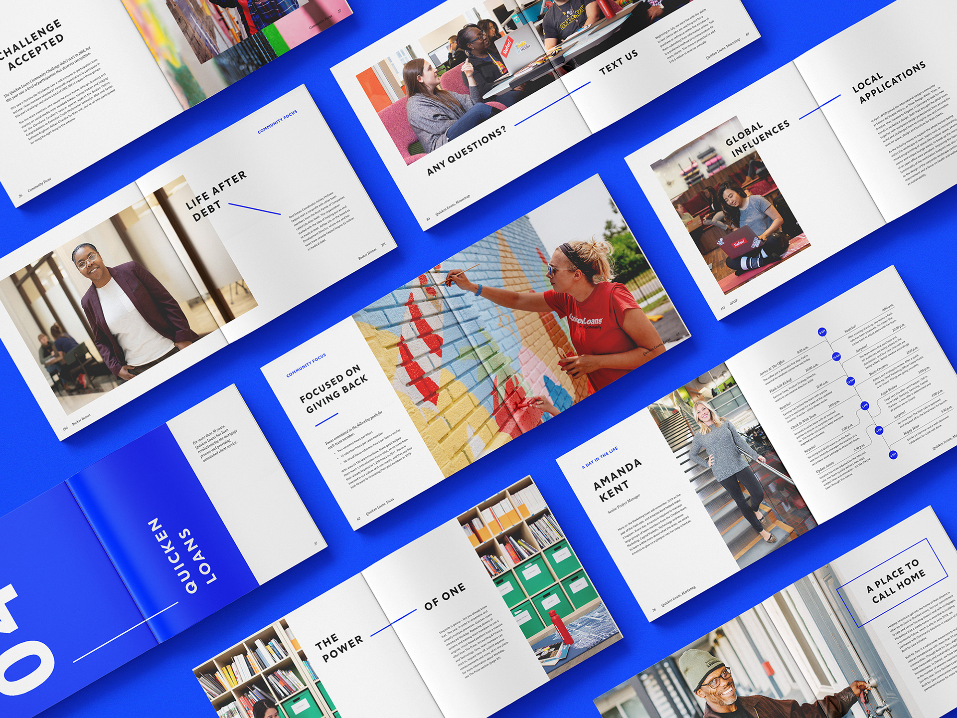
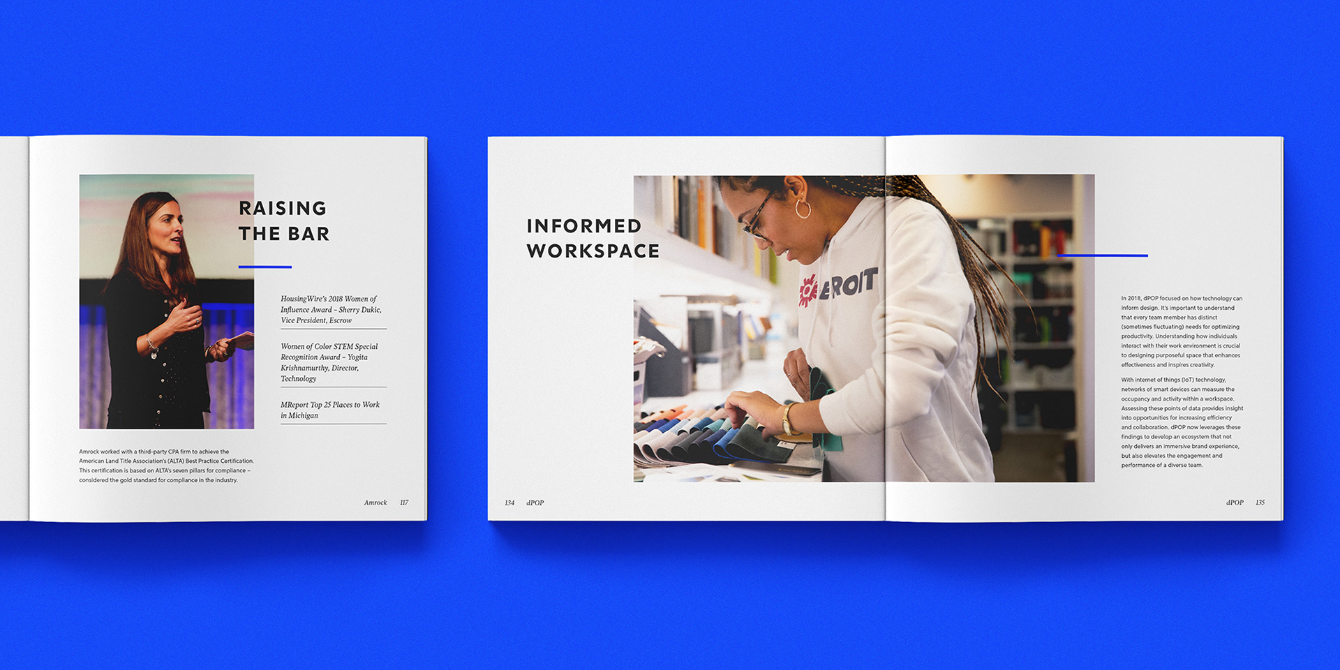
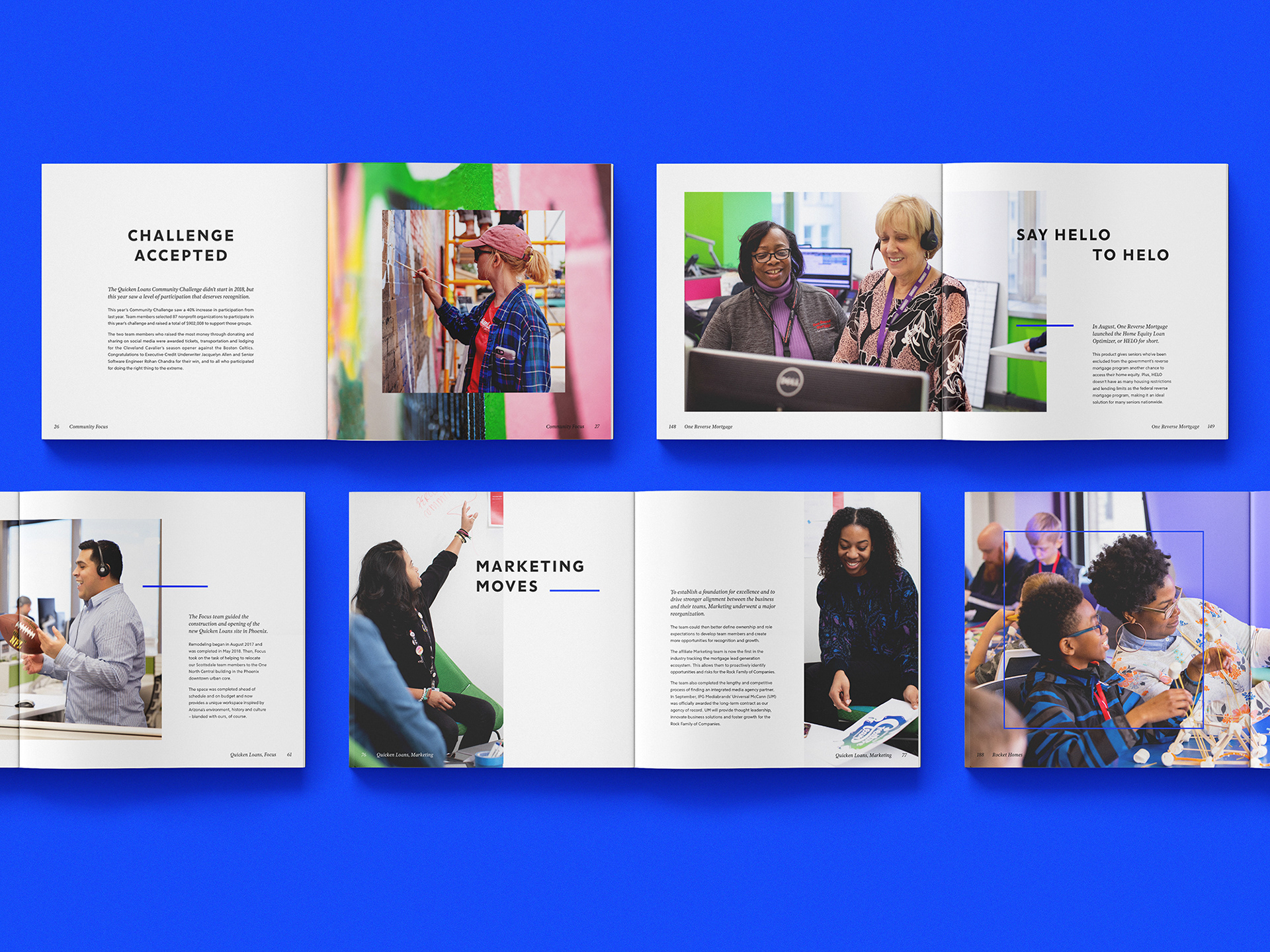
Visually, the design is clean, structured, and photography-forward. Grids of squares and rectangles were used to frame copy and imagery, while fine lines subtly guide the eye and create visual relationships between content. By leaning into generous white space and striking, full-bleed photography, we let the stories and people take center stage.
To bring cohesion to the piece, we introduced a single accent color—a vibrant cobalt blue. It delivered the energy we wanted without defaulting to the red associated with Quicken Loans, allowing the book to feel representative of the broader Rock Family brand.
The result is a thoughtfully designed, editorial-style piece that honors the work of the past year while reinforcing a shared vision for what’s ahead.